A low contrast, geometric typeface for today’s communication in the digital and print world.
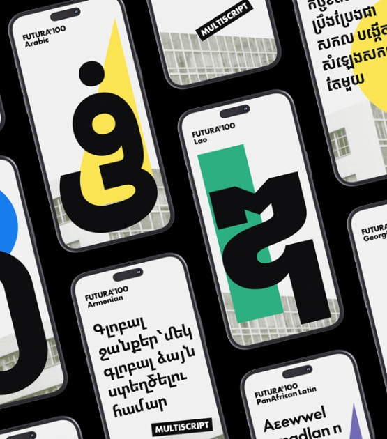
After 100 years with limited script availability, Paul Renner’s original design has finally been remade for our current age. Futura®100 comprises 23 scripts with six weights in each. A majority of these scripts will feature matching obliques, as well as an optical size axis for enhanced reading. With language support for more than 90% of the world’s population, Futura®100 is historically introspective, globally applicable, and stylistically comprehensive.
The original Futura® was the ultimate in geometric sans serifs, reducing a design category to its most concentrated concept and form. In concert with Bauer Types, TypeTogether has brought together the widest global talents to release Futura®100, the epitome of minimalist geometric typefaces, while maintaining faithfulness to the original shapes. Not an evolution, but a true expansion across time that honours Renner’s intention.
There are two basic reasons for a new Futura. The first is language support. Until now only a few scripts have ever been created, but TypeTogether will release Futura®100 in 23 scripts by the end of 2026 (12 in 2025 and the rest in 2026, including support for major Indic scripts as well as Simplified Chinese and Hangeul). This will make Futura®100 one of the few truly global typefaces — communicating in more scripts and languages than ever before. Current scripts include: Armenian, Cyrillic, Georgian, Greek, Hebrew, Khmer, Lao, Latin, PanAfrican Latin, Thai (these ten with obliques), Arabic, and Myanmar. With such extensive coverage, Futura®100 is a great fit for agencies and brands with global reach and multinational commitments.
The second major reason for a new design is to make it more accurate, more powerful, and more aligned with digital publishing needs. After more than two years of archival research, letterform comparison, and usage assessment, Futura®100 is the archetype of Renner’s original interpretation, updated for current expectations, emotional gravitas, and worldwide use. It is perfect for brands already using Futura® but wanting something optimised for readability, global usability, and flexibility across different devices and media. The families come in six weights (Light, Book, Regular, Medium, Demibold, Bold) along with additional obliques and optical size variations. Meaning, each script has up to 24 styles to carry the momentum of every modern story, dynamic action, marketing breakthrough, and rational directive.
It wouldn’t be a proper update without all the desired typographic niceties: case-sensitive punctuation, small caps, five sets of figures for setting tables or text, geometric alternates, arrows, ligatures, script-specific alternates, and more. Along with other script-specific features, small text can be adjusted with an optical size axis in selected scripts. This changes character spacing and extender length so paragraphs are more readable.
What was new and disruptive for its time has now become a hinge upon which type design turns and graphic design rests. More than mechanical, Futura®100 is structural. It gives such strength and stamina to the text that it has lasted a century and, with this iteration, will remain in constant use by more designers worldwide for the foreseeable future.
CREDITS
Lead design and concept
Paul Renner*, Veronika Burian, José Scaglione
*Futura®100 is a revision and expansion of Paul Renner's original design, published in 1927 by Bauersche Giesserei (now Bauer Types)
Type designers
Azza Alameddine (Arabic)
Kostas Bartsokas (Greek)
Yorlmar Campos (Latin, PanAfrican Latin)
Suppakit Chalermlarp (Lao)
Vera Evstafieva (Cyrillic)
Tom Grace (Latin, Hebrew)
Gor Jihanian (Armenian)
Ben Mitchell (Myanmar)
Ana Sanikidze (Georgian)
Smich Smanloh (design director: Khmer, Lao, Thai)
Sovichet Tep (Khmer, Myanmar)
Knaz Uiyamathiti (Thai)
Anuthin Wongsunkakon (design director: Khmer, Lao, Thai)
Technical advisor
Simon Cozens
Quality assurance
Viviana Monsalve
Engineering
Joancarles Casasín
Sovichet Tep (Myanmar)
Kerning
Radek Sidun (Latin)
Graphic design
Elena Veguillas (Art director)
Rabab Charafeddine
Felicia Priscillya
Motion design
Cecilia Brarda
Copywriting
Joshua Farmer
Social Media Manager
Doug Arellanes
Consultants
Khajak Apelian (Armenian)
Shani Avni (Hebrew)
Gerry Leonidas (Greek)
Ben Mitchell (Southeast Asian scripts)
Krista Radoeva (Cyrillic)
Akaki Razmadze (Georgian)
Mamoun Sakkal (Arabic)
Donny Truong (Vietnamese support)
Taurai Valerie Mtake (PanAfrican Latin)
About Futura®
Original design: Paul Renner
Copyright of the original design: Bauer Types S.L.
Copyright of Futura®100: TypeTogether (with authorization from Bauer Types).
Futura® is a registered trademark of Bauer Types S.L. Used under license.